Geckoboard
Updating a 12 year old interface, whilst enhancing the usability and readability of TV dashboards.
Geckoboard allows people to display their dashboards on an office TV or big-screen monitor in minutes, to make key metrics unmissable for their team.

The problem
We want our customers to be making best in class
dashboards: dashboards that look great, effectively
communicate their data by showing relationships and
hierarchy and are easily understood by anyone who
views them.
We want our customers to be making best in class dashboards: dashboards that look great, effectively communicate their data by showing relationships and hierarchy and are easily understood by anyone who views them.
Research phase
I reviewed around 50 customer dashboards to establish the main problems. this involved interviewing customers, as well as reviewing our bank of dashboards that customers had periodically sent to us.
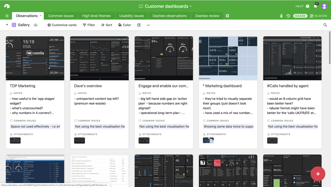
Using Airtable, I logged the dashboards and tagged common findings, which were prioritised into importance of how many times they appeared:
- No sense of relationships
- Cognitive overload. Some dashboards had up to 36 widgets, all the same size. It was hard to know where to look, what was important
- Number widget not using the space of its container - resulting in lots of whitespace in a dashboard where space is at a premium
- Numbers misaligned, making it hard to compare and scan metrics
Before taking the project any further, my Product Manager and I took several of the ‘worst’ dashboards customers had created and set out to make them better using the product as it was. We wanted to be absolutely certain that the problem was in our current solution, and not the education that we’re providing our customers. We wondered if actually we could not build anything new and instead perhaps educate or guide users to better solutions.
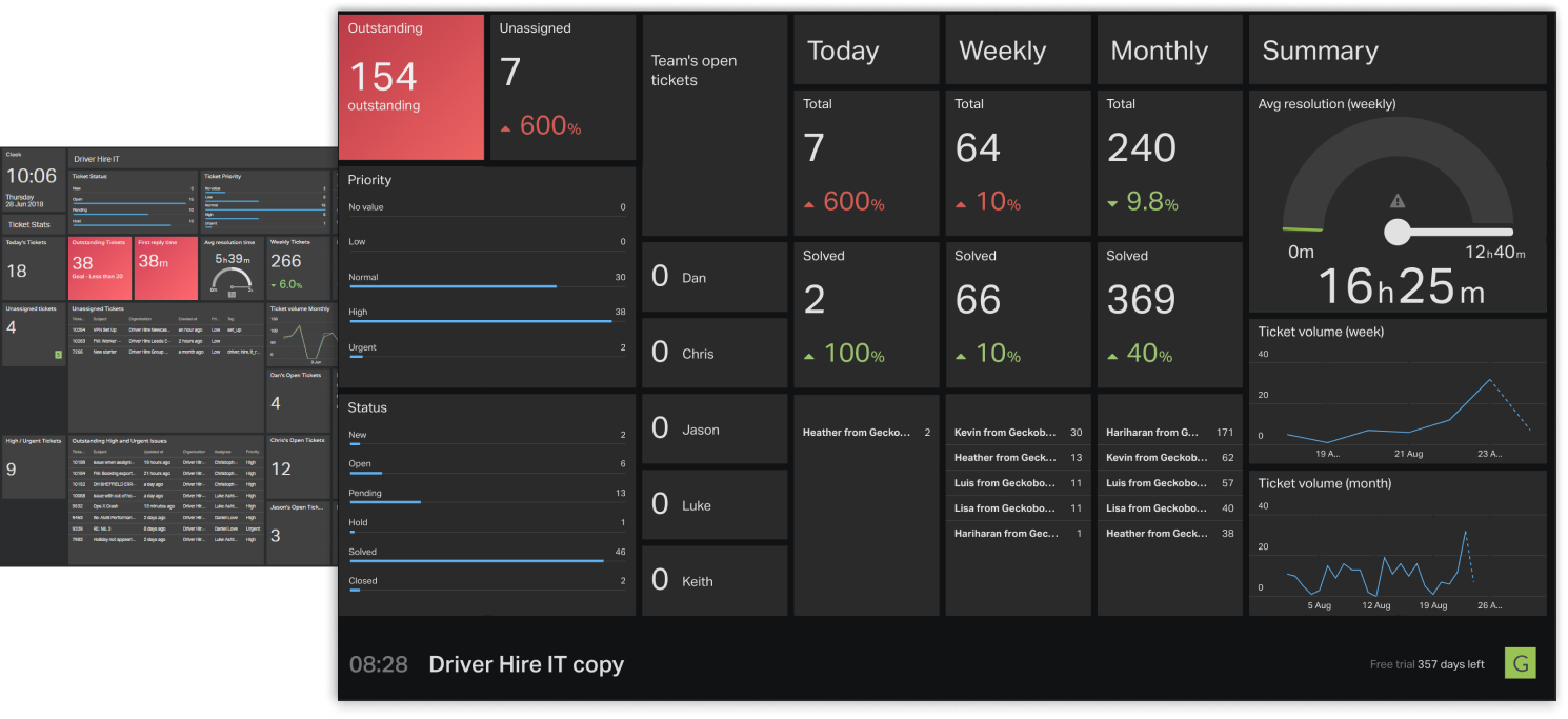
The result was that yes, we could make them a little better, but it was still really hard to see relationships and there was still a lot of repetition. Given that we, the ‘dashboard design professionals’ couldn’t make something that we considered great, we felt more confident that we needed to make bigger changes to the dashboards.
Proposed solution
Grouping functionality
The ability to group metrics
will help to show relationships in data, help with cognitive overload
and is a start towards showing hierarchy.
The ability to group metrics will help to show relationships in data, help with cognitive overload and is a start towards showing hierarchy.
Sketching session
This project was my first after joining Geckoboard, and whilst I had lots of ideas, I knew that senior stakeholders and longer standing colleagues had much more domain and technical knowledge than me, so to leverage this, I invited them to sketch out their ideas with me.
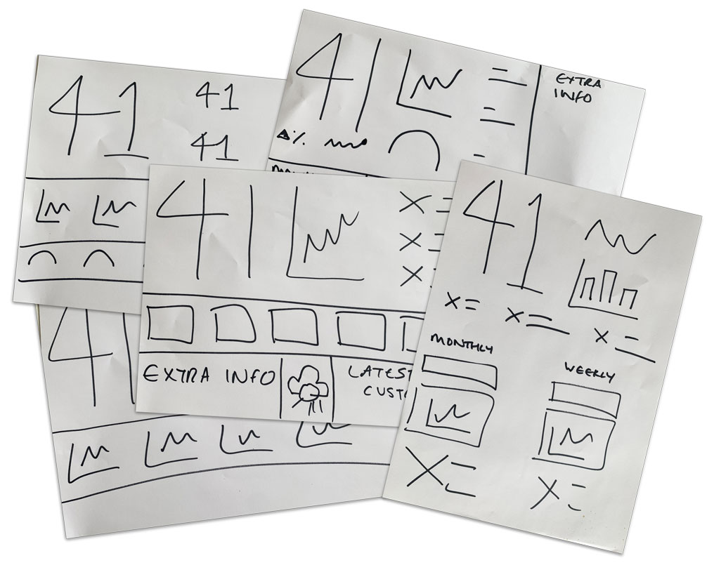
It was great to see how creative people were with their grouping:
- Most important metrics in larger groups, higher up the viewport
- Portrait dashboards
- Less of a grid
Design test
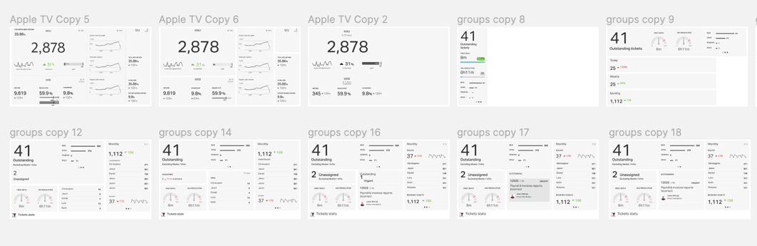
I took the sketches and mocked them up into a rough, but idealistic end result using data from a real customer dashboard.
It was clear at this point that we saw real value in being able to group metrics. This has multiple benefits: clear relationships shown, less repetition of text in titles, and less cognitive load.
Prototyping
Once we were happy with the notion of grouping; how it would look and also the technical feasibility, we began protyping the UX to group metrics together.
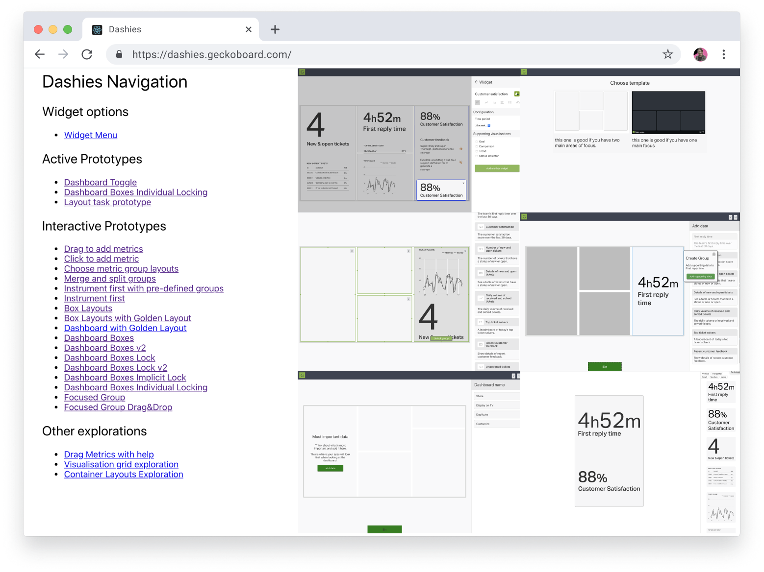
In this phase, I was working with one frontend developer. We were making fast prototypes, testing and then making quick changes. As we were such a small team (one PM, one dev and me) we were testing a LOT but taking it in turns to lead the sessions. This was great as we all got to be involved, see the pain points and come to the same conclusions together.
The results
At the end of the project, I gathered screenshots of the new dashboards and reviewed them using the same criteria as my initial review. This exercise also doubled up as a review of these dashboards to highlight the main bugs and issues. In true meta fashion, I made a dashboard of the results:
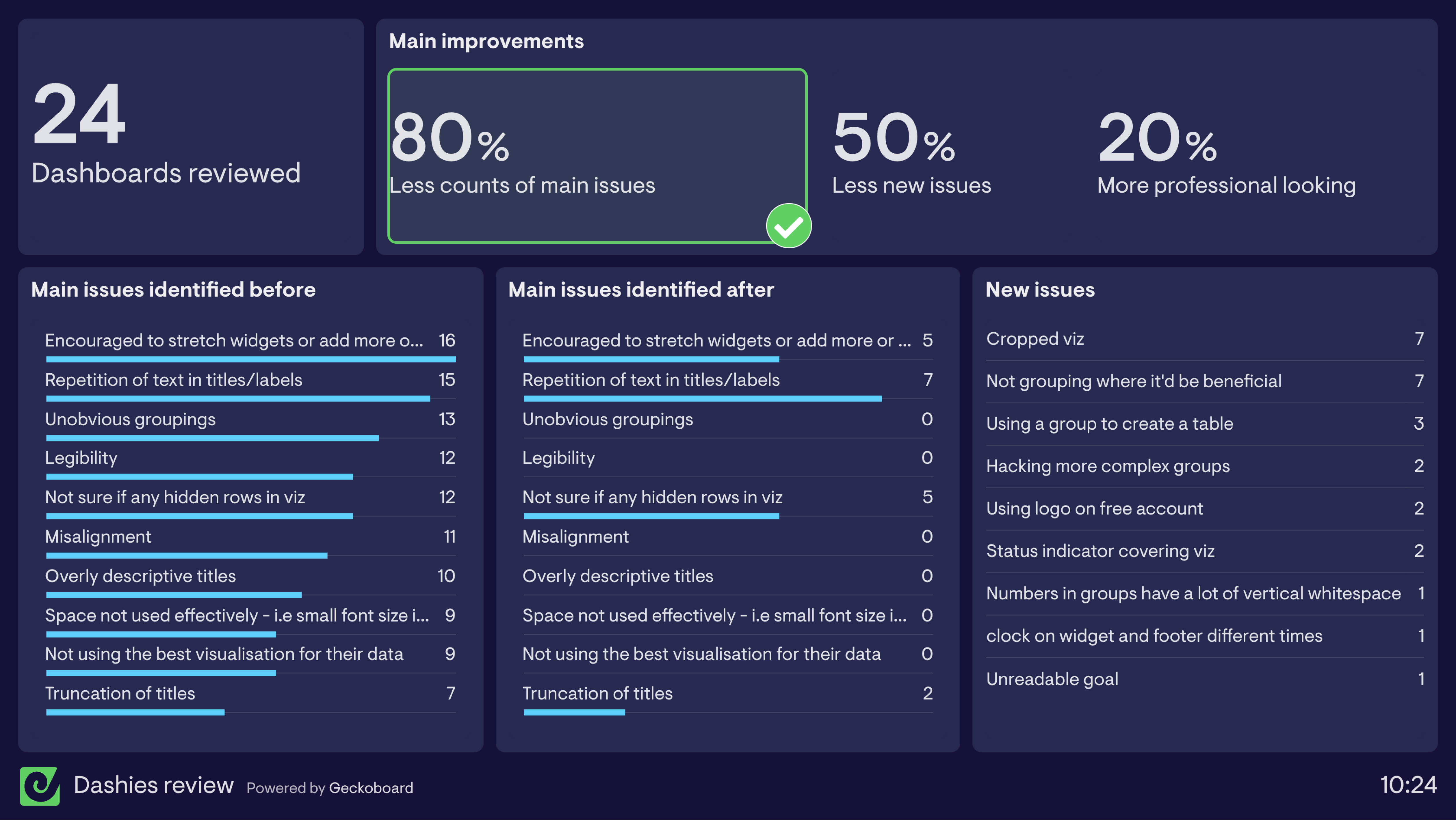
Next up will be iteration! Watch this space.